
2026 Digital Marketing Trends Guide for Growth
Unlock the future with our 2026 digital marketing trends guide. Discover AI personalization, GEO, and more strategies for lasting growth!

TL;DR:
- High conversion websites focus on encouraging visitors to take specific actions, not just look attractive.
- Essential elements include fast load speed, clear CTAs, trust signals, mobile responsiveness, and simple navigation.
- Continuous measurement and testing are crucial for improving conversion rates and driving business growth.
Your website might look stunning. Clean design, beautiful photos, smooth animations. But if visitors land on it and leave without calling, booking, or buying, it’s not doing its job. A high conversion website isn’t just attractive — it’s built with one purpose: turning visitors into leads and customers. Most small business sites are designed to impress, not to perform. This guide breaks down what conversion actually means, which elements drive it, and how you can build or optimize a site that generates real, measurable business growth.
| Point | Details |
|---|---|
| Conversion defined | A high-conversion website is designed to turn visitors into leads or sales by focusing on specific goals. |
| Core elements matter | Page speed, clear CTAs, mobile design, and trust signals have the biggest impact on conversion rates. |
| Continuous improvement | Tracking, testing, and optimizing over time deliver the greatest gains in performance. |
| User experience is critical | Simplifying navigation and removing friction leads to a measurable boost in conversions. |
Let’s cut through the noise. A conversion happens when a visitor takes a specific action you want them to take. That could be filling out a contact form, calling your office, booking a consultation, downloading a resource, or completing a purchase. Every business defines its conversions differently, and that’s the first thing you need to get clear on.
For service businesses, the most valuable conversions are usually:
For e-commerce businesses, conversions center on:
Your conversion rate is simple to calculate:
Conversion Rate = (Total Conversions ÷ Total Visitors) × 100
So if 1,000 people visit your site and 30 fill out your contact form, your conversion rate is 3%.
Conversion rates in many industries average 2 to 5%, which means most sites are already losing the majority of their traffic. Even moving from 2% to 3% can mean 50% more leads from the same traffic volume. That’s not a small deal.
| Metric | What it measures | Why it matters |
|---|---|---|
| Conversion rate | % of visitors who act | Core performance indicator |
| Bounce rate | % who leave immediately | Signals poor UX or wrong audience |
| Time on page | How long visitors stay | Indicates content relevance |
| Click-through rate | % who click a CTA | Measures CTA effectiveness |
One of the biggest myths is that conversions only mean sales. That’s wrong. Micro-conversions, like clicking a pricing page, watching a video, or downloading a guide, all signal intent and move visitors closer to becoming customers.
Pro Tip: Set up micro-conversion tracking in Google Analytics or a tool like Hotjar. Knowing which buttons people click (and which they ignore) tells you exactly where to boost conversion rates without guessing.
With the meaning of conversion rates set, let’s pinpoint what separates ‘pretty’ sites from those built to drive action. The truth is, website design impacts on leads far more than most business owners realize. Design isn’t just aesthetics — it’s strategy.
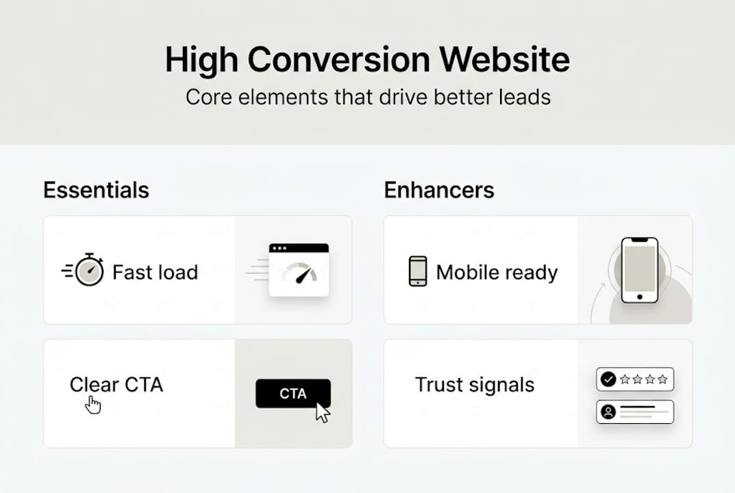
Here are the non-negotiable elements every high-converting site needs:
| Element | Essential | Nice to have |
|---|---|---|
| Fast load time | ✓ | |
| Clear CTA on every page | ✓ | |
| Mobile responsive design | ✓ | |
| Video background | ✓ | |
| Animated scroll effects | ✓ | |
| Live chat widget | ✓ | |
| Trust badges and reviews | ✓ |
The sites that convert best are rarely the flashiest. They’re the clearest. Every custom site feature should serve a conversion purpose, not just look impressive in a portfolio.
Pro Tip: Use one primary CTA per page. When you give visitors too many options, they choose none. Pick the single most important action and make it impossible to miss.
Once foundational elements are in place, the overall experience visitors have directly affects whether they convert. User experience, or UX, is the sum of every interaction a visitor has with your site. Friction kills conversions. Clarity creates them.

Think about it from your customer’s perspective. They land on your site with a problem. If they have to hunt for your phone number, wade through walls of text, or wait for slow pages to load, they’re gone. Slow or confusing websites lose visitors who are ready to act, and those are the most valuable visitors you’ll ever get.
Common UX mistakes that kill conversions:
Small changes create big results. Shortening a contact form from 8 fields to 4 can double your submission rate. Changing a button from gray to a high-contrast color can lift clicks by 20% or more. These aren’t guesses — they’re the kind of wins that come from testing and paying attention.
“The best-converting pages aren’t the most beautiful. They’re the ones with the least friction standing between the visitor and the action.”
For building high-conversion landing pages, the same UX rules apply. One message, one audience, one CTA. No distractions. Check out service page examples that show how focused structure translates directly into more inquiries.
Pro Tip: Use heatmap tools like Microsoft Clarity (free) or Hotjar to watch real users interact with your site. You’ll quickly spot where people drop off, what they click, and what they ignore entirely.
Knowing what works, your next step is putting theory into action. Here’s a clear, actionable process to get started:
Useful tools for testing and optimizing:
Custom website design can significantly boost online leads when it’s built around conversion strategy from the start. Explore different business website types to understand which structure fits your goals, and look at WordPress website examples for service businesses to see what high-performing sites actually look like. For a detailed walkthrough of attracting qualified prospects, this step-by-step lead generation resource is worth your time.
Here’s the uncomfortable truth: most small business websites fail at conversion not because of bad design, but because of a lack of focus and zero measurement. Owners spend thousands on a beautiful site, launch it, and then wait. No tracking. No testing. No iteration. Just hope.
Conversion is not a one-time setup. It’s a discipline. The businesses we see winning online aren’t necessarily those with the biggest budgets. They’re the ones paying attention to their numbers and making small, consistent improvements every month.
The other trap is complexity. Business owners assume more features equal more conversions. More popups, more animations, more sections. In reality, simplicity almost always wins. A single clear CTA outperforms a page with five competing options every time. These real conversion insights back that up consistently. And when you pair focused design with smart customer acquisition strategies, the results compound quickly. Stop chasing shiny features. Start measuring what moves the needle.
If you’re ready to see these strategies come to life on your website, here’s how MonsterWP can help.
We build, host, and manage high-performance WordPress websites designed to convert from day one. No bloated agency fees. No DIY headaches. Every custom website service we deliver is built with Elementor Pro, optimized for speed and SEO, and supported with unlimited content updates. Whether you need simple WordPress websites or fully managed WordPress sites with ongoing growth support, we have a plan that fits. Starting at $299 per month, you get a digital engine that works without constant babysitting. Let’s build something that actually converts.
Divide the number of desired actions (like form fills or sales) by total visitors, then multiply by 100. For example, 30 conversions from 1,000 visitors equals a 3% conversion rate.
Aiming for 2 to 5% is a solid benchmark, but even a half-percent improvement over your current average can translate into significantly more leads each month.
Fast load times, clear CTAs, mobile usability, and strong trust signals are the biggest drivers. Website design strongly impacts conversion performance, especially for service businesses competing on credibility.
Absolutely. When built with a conversion-first approach, WordPress sites can deliver excellent results. Custom website design focused on speed, usability, and clear CTAs makes WordPress one of the strongest platforms for lead generation.
Unlock the future with our 2026 digital marketing trends guide. Discover AI personalization, GEO, and more strategies for lasting growth!

Discover what is predictable pricing in web services and learn how fixed costs can empower your SMB’s budget. Gain financial control today!